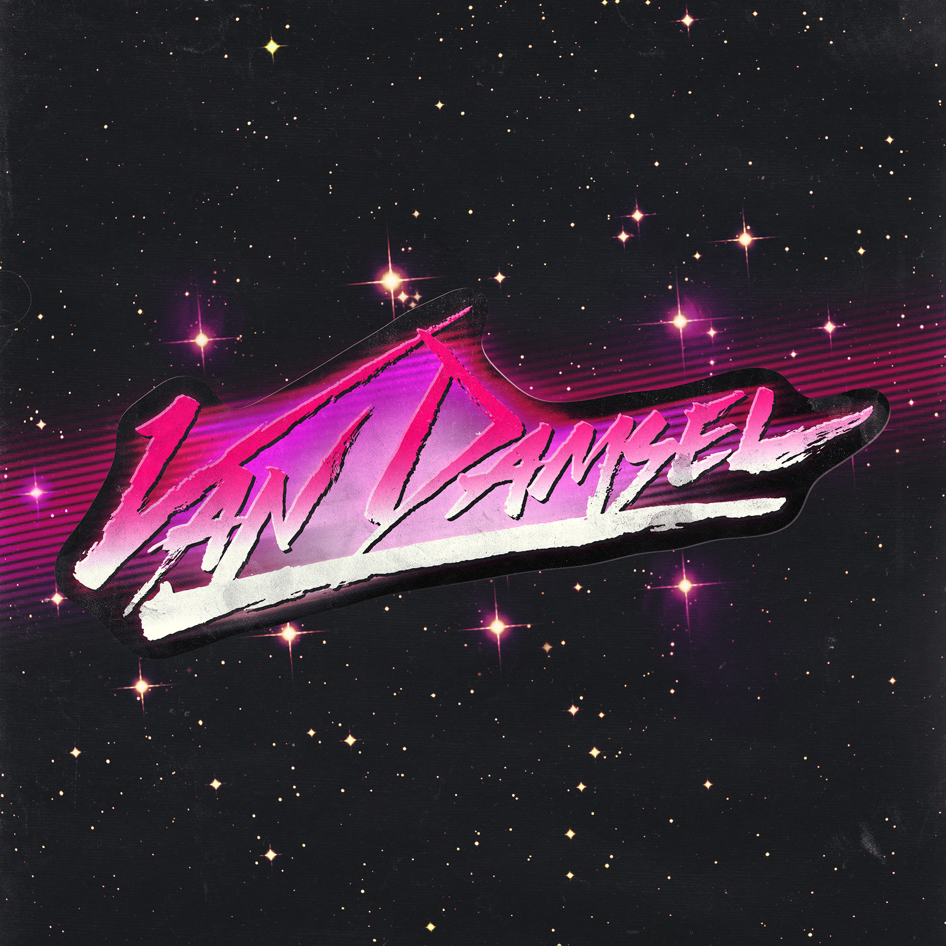

Van Damsel approached me in late December 2014 about revisiting their logo. They’d been recording a new album over the last few months and wanted a brand that would reflect their sonic maturation. The timing couldn’t have been better as I’d just bought my first Pental brush pen (in love) and had been experimenting for a week or so before I started working on concepts for them.
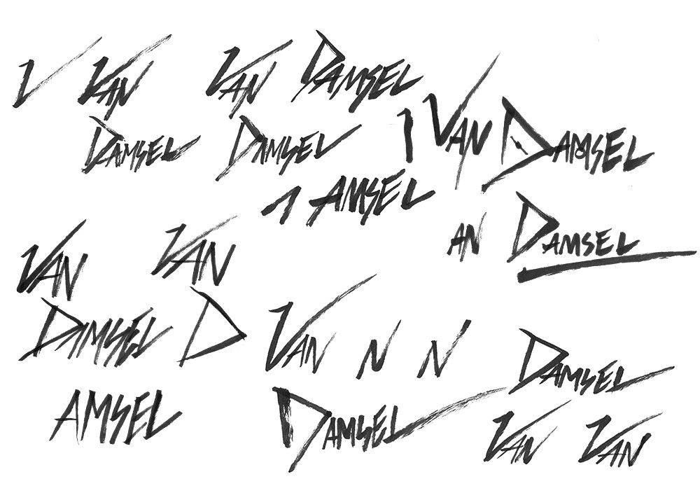
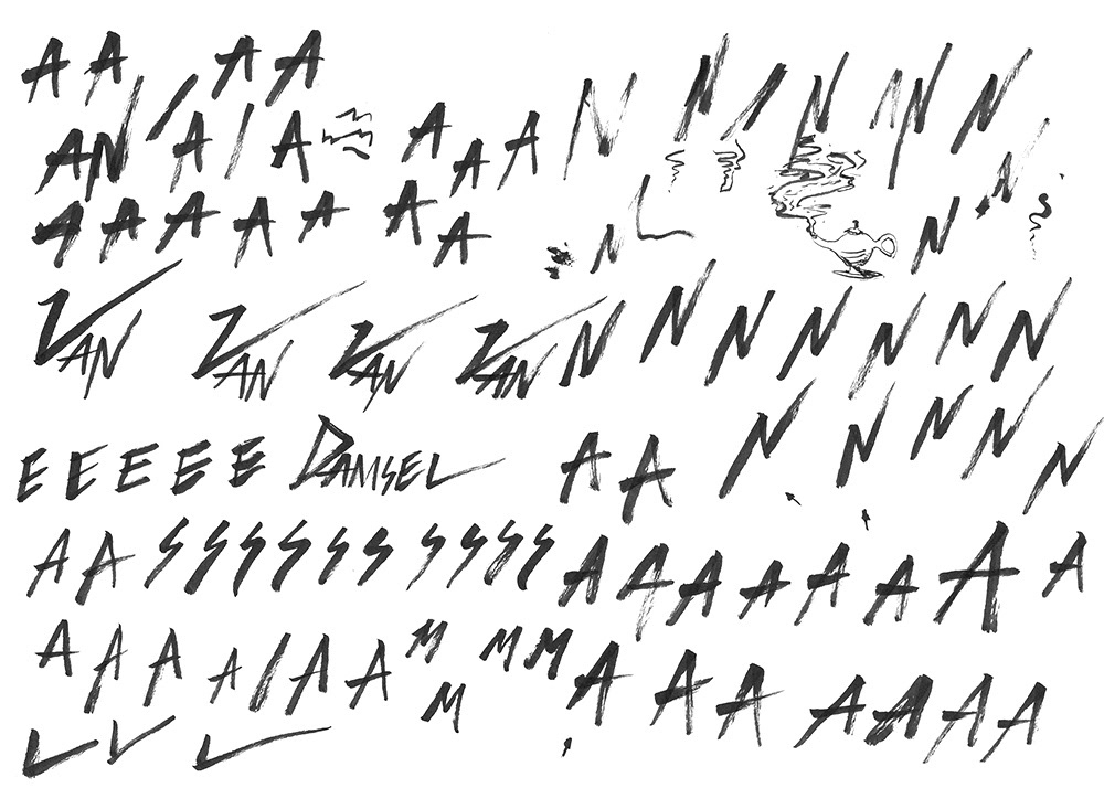
After a general angle and look was decided on, it was down to tweaking each individual letter to make it the best it could be while still supporting the whole. You can see a few arrows pointing at ‘N’s and ‘A’s that I thought might look better in the scratch paper below.
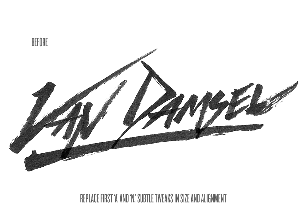
In the end I used an entire ink cartridge on the first day (you can see the fading in some of the ‘N’s below) of working on their logo, I’m really happy with where we got it. It looked fine in its painted-on brush look — a look that would work extremely well in a different branding exercise — but we were going for something a little less defined, something to reflect a cheaply-painted-on-paper-in-the-’80s look.